Amsterdam // Graphic & Editorial
Mainstudio
His body of work includes topics on architecture, art, and design and the underlying patterns that link them all together.

0:00
/
3:54
His body of work includes topics on architecture, art, and design and the underlying patterns that link them all together.
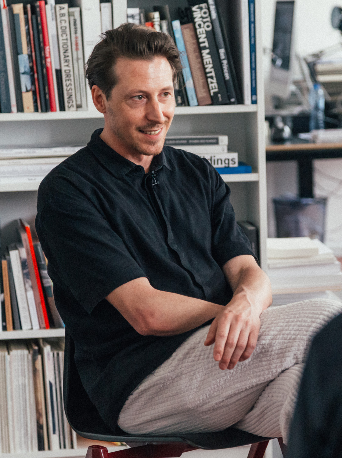
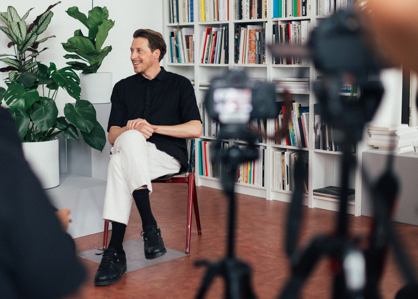
Edwin van Gelder is a graphic designer working mostly in identity and book design. His body of work includes topics on architecture, art, and design and the underlying patterns that link them all together.
Edwin van Gelder prefers to connect with the work on a personal level, balancing pragmatic and intuitive descisions to show the content passionately and honestly.
When you go [to an] average bookstore, you see so many books that don't have a soul.
He considers Swiss design similar to architecture, treating books as architectural objects and each page as a space.

In the Netherlands, it's a bit more experimental, [but] I'm still inspired by Swiss design, mainly.
I want to have the same experience as you walked through Tirzo's art exhibition, as you go through this book.
In the margins of Tirzo Martha's monograph you can navigate a route through the book, but that margin is also used for page numbers and captions for the images.
For me, it's difficult to select colours purely intuitively because I use colours more like a system to differentiate different content or to show different layers of content.
Edwin describes his work as Systemic Design - a term coined by Swiss designer Karl Gerstner in his book "Designing Programmes". Through this, he conveys the content and voice of the book or identity through the designs they are bound in.
I don't want to make statements with other people's content, but I do want to show my voice and my way of telling the story.
When you go [to an] average bookstore, you see so many books that don't have a soul.
In the Netherlands, it's a bit more experimental, [but] I'm still inspired by Swiss design, mainly.
For me, it's difficult to select colours purely intuitively because I use colours more like a system to differentiate different content or to show different layers of content.
I don't want to make statements with other people's content, but I do want to show my voice and my way of telling the story.
00:00:06
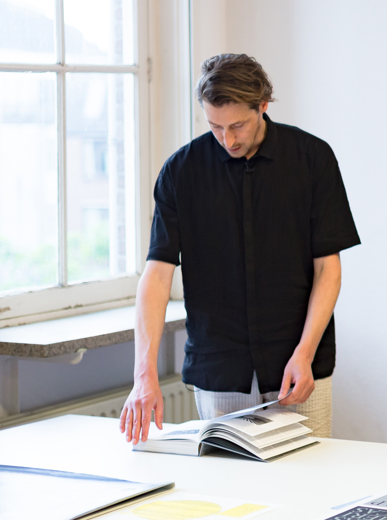
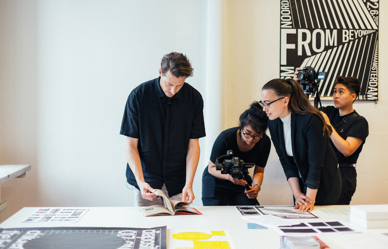
My name is Edwin Van Gelder, and I started as a graphic designer around 10 years ago. Started my studio in Amsterdam, focusing on identities in book design.
00:00:24
I can work with many clients, but I really liked that the content is honest and really passionate.
00:00:32
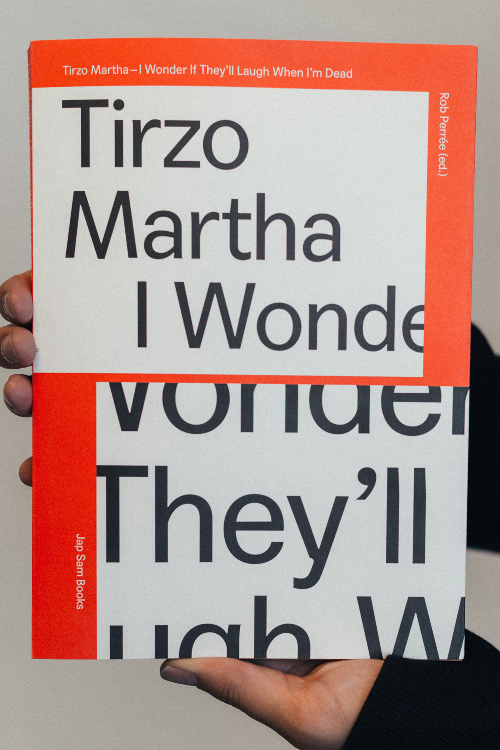
Tirzo Martha is a very passionate person, very politically active in Curacao, and really expressive kind of artist. He had a solo show so he wants to have a monograph.
00:00:46
I make clusters of, of his work and cut out different works and made sequences. By making sequences of all the, all the works and put them in sections of a book, he makes sort of visual narratives of his work. And his visual narratives are also connected in the book by the margins of the book. You see how the white space is connecting each different installation. So these white spaces, are really like walking through an exhibition.
00:01:27
And the cover reflects the whole structure of the book. So here you see how the images are placed with white squares, and typography, and the title.
00:01:44
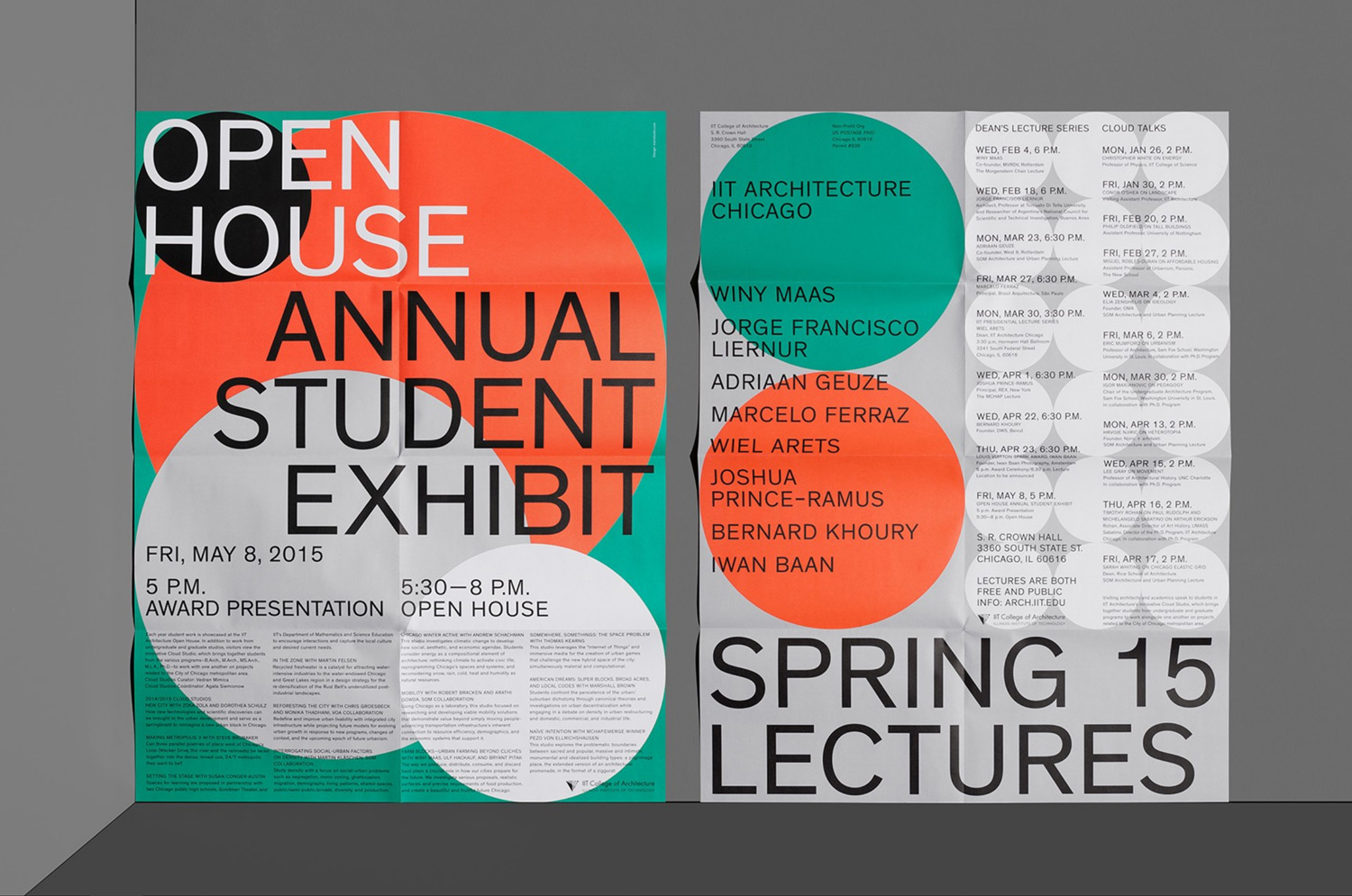
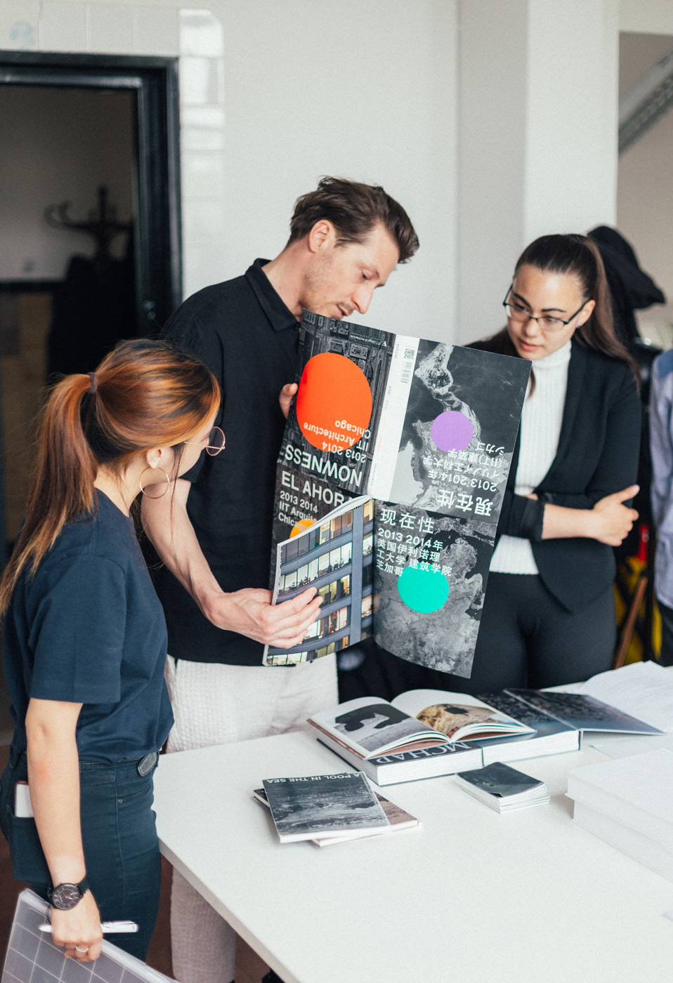
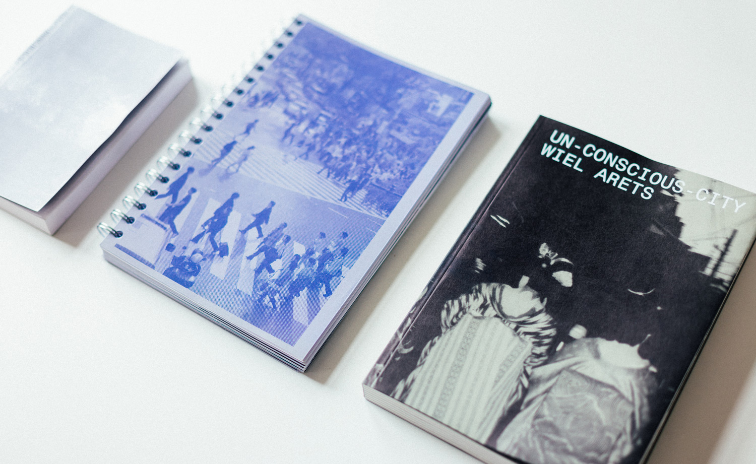
In 2013, Dean Wiel Arets asked me to make a perspective and an identity for the school of Architecture in Chicago. After some research I was really inspired by Charles and Ray Eames’ powers of 10.It’s a commercial for IBM.
00:02:06
The cover of the book is representing different zoom ins of Chicago, and the dots are representing cities because the curriculum is about the new metropolis.
00:02:18
Everything was meant to communicate to students mainly. So, the colours are very systematic. I just used the most famous four colors—the most common four colors—and then use them for different information zones.
00:02:35
There's a sort of structure in the, in the page numbering and the chapter system. So basically you use like a map. You also have on the sides, you have different coordinates where to be placed on a map. The page numbers are below and on the right side— well, in the beginning, they are on the top.
00:02:56
One funny chapter I came up with is the Chicago heroes. To place Chicago on a map, we just selected ten heroes of Chicago like Herbie Hancock and Bill Marray to show the history of Chicago.
00:03:17
At the moment I'm just searching still for what my practice is about. When you find your trajectory or your voice within a certain profession, you can broaden your horizon and then apply it to different media and solutions. I don't want to make statements with other people's content, but I do want to show my voice and my way of telling the story. So it's not only facilitating a platform for content, but it's also having a voice within.